

How to Write Website Copy That Converts
Most website copy talks about the company instead of the visitor. A practical guide to headlines, CTAs, and copy that actually converts.


Nobody visits a website hoping to be sold to. They arrive with a question, a problem, or a need. They want to know if you can help. They want to understand what you offer. They want to decide if this is right for them.
Your job is not to convince them. Your job is to communicate clearly.
The best website copy does not feel like marketing. It feels like a helpful conversation. It answers questions before they are asked. It speaks to real problems in plain language. It guides people toward a decision without pressure.
This is harder than it sounds. Most website copy falls into one of two traps: either it is so focused on selling that it feels pushy, or it is so vague that it says nothing at all.
Here is how to write copy that actually converts without making visitors feel like they are being manipulated.

The Foundation: It Is Not About You
The most common mistake in website copy is talking about yourself.
- "We are a passionate team dedicated to excellence."
- "Our company was founded in 2015 with a vision."
- "We pride ourselves on our innovative approach."
Nobody cares. Not because they are rude, but because they are busy. They came to your website to solve their problem, not to learn about your journey.
Effective website copy focuses on the visitor, not the business.
Instead of "We offer professional photography services," write "Get photos that make your business look established."
Instead of "Our team has 20 years of combined experience," write "Work with photographers who have shot 500+ business portraits."
Instead of "We are passionate about design," write "Your website will look like you hired an expensive agency."
The shift is subtle but powerful. Every sentence should answer the visitor's unspoken question: "What does this mean for me?"
A simple test: Count how many times your homepage says "we," "our," or "us" versus "you" and "your." If the first group wins, rewrite.
Headlines That Actually Work
Your headline is the most important piece of copy on any page. Most visitors decide whether to stay or leave based on the headline alone.
Yet most headlines are terrible.
What does not work:
- "Welcome to Our Website" - Says nothing.
- "Innovative Solutions for Modern Businesses" - Buzzword soup.
- "The Best Choice for Your Needs" - Empty claim.
- "Excellence in Everything We Do" - Meaningless.
These headlines fail because they could apply to any business. They communicate nothing specific. They waste the most valuable real estate on your page.
What works:
- Specific outcomes: "Get a professional website live this weekend"
- Clear value: "Wedding photography starting at $2,000"
- Direct relevance: "Accounting for freelancers who hate accounting"
- Problem acknowledgment: "Stop losing customers to slow load times"
The formula for effective headlines:
- State what you do or what the visitor gets
- For whom
- With what differentiator or outcome
- "Custom furniture for small apartments that actually fits."
- "Tax prep for freelancers, done in one session."
- "Website hosting that stays up when you get featured on the news."
Specificity beats cleverness every time. A boring headline that clearly explains your offer outperforms a creative headline that confuses.

Subheadlines That Support
The headline gets attention. The subheadline keeps it.
Your subheadline should expand on the headline without repeating it. It adds context, addresses a secondary concern, or provides proof.
Headline: "Get a professional website live this weekend" Weak subheadline: "We help you build websites quickly" (just repeats the headline) Strong subheadline: "Pre-designed blocks you customize in minutes. No design skills needed."
Headline: "Accounting for freelancers who hate accounting" Weak subheadline: "Professional accounting services for independent workers" Strong subheadline: "One monthly session. We handle everything. You get back to actual work."
The subheadline is where you can add:
- How it works (briefly)
- Social proof snippet
- Key differentiator
- Objection handling
Do not waste it on generic statements. Every word should earn its place.
Writing Body Copy That Gets Read
Here is a hard truth: most visitors will not read your body copy. They will scan it.
Eye-tracking studies confirm this consistently. People do not read websites like books. They jump around. They look for relevant information. They skip anything that looks like a wall of text.
This changes how you should write.
Short paragraphs. One to three sentences maximum. White space helps scanning.
Front-load information. Put the important point first in each paragraph. If someone only reads the first sentence, they should still get the message.
Use subheadings. Break content into sections. Subheadings let scanners find what they care about.
Bold key phrases. Strategic bolding guides the eye. It creates a secondary reading path for scanners.
Bullet points for lists. When you have multiple items, bullet points are easier to scan than comma-separated lists in a paragraph.
This article follows these principles. Notice the short paragraphs. Notice the bolded key points. Notice the structure. This is not just for readability. It is for conversion.
The Problem-Solution Framework
One of the most effective structures for website copy is simple: problem, then solution.
Step 1: Acknowledge the problem.
Show visitors you understand their situation. Use their language. Describe their frustration accurately.
"You have tried three website builders. Each one took weeks to learn. Your site still does not look professional. You are starting to think you need to hire someone."
This is not manipulation. This is empathy. When visitors feel understood, they trust that you might actually be able to help.
Step 2: Present your solution.
Explain how you solve the problem. Be specific. Focus on outcomes, not features.
"Beste gives you pre-designed blocks that already look professional. Pick the blocks you need, add your content, publish. The design decisions are already made. You focus on your message."
Step 3: Provide proof.
Claims are cheap. Proof is persuasive.
"Sarah launched her consulting site in one afternoon. No design experience. No code. Her exact words: 'I kept waiting for it to get complicated. It never did.'"
This framework works for entire pages and for individual sections. It is effective because it follows how people actually make decisions: recognize the problem, evaluate the solution, look for evidence.

Writing Calls to Action That Get Clicked
The call to action is where conversion happens. Or does not happen.
Most CTAs are lazy.
"Submit" "Click Here" "Learn More"
These tell visitors nothing about what happens next. They feel generic. They do not motivate action.
Effective CTAs have three qualities:
1. They describe the outcome, not the action.
- "Submit" becomes "Get My Free Quote"
- "Sign Up" becomes "Start Building Free"
- "Learn More" becomes "See How It Works"
The visitor knows what they will get, not just what they will do.
2. They reduce perceived risk.
- "Start Free Trial" is better than "Sign Up"
- "See Pricing" is better than "Buy Now"
- "Get Started Free" is better than "Create Account"
Lower commitment language gets more clicks. You can ask for more commitment later in the process.
3. They create gentle urgency without being pushy.
- "Get your free quote today" feels more immediate than "Get your free quote"
- "Start building your site" feels more actionable than "Learn about our platform"
Urgency does not require countdown timers or "ONLY 3 LEFT!" nonsense. It just requires language that suggests action now rather than later.
Placement matters too. Your primary CTA should appear above the fold, after your value proposition is clear, and again at the bottom of the page. Visitors should never have to hunt for how to take the next step.
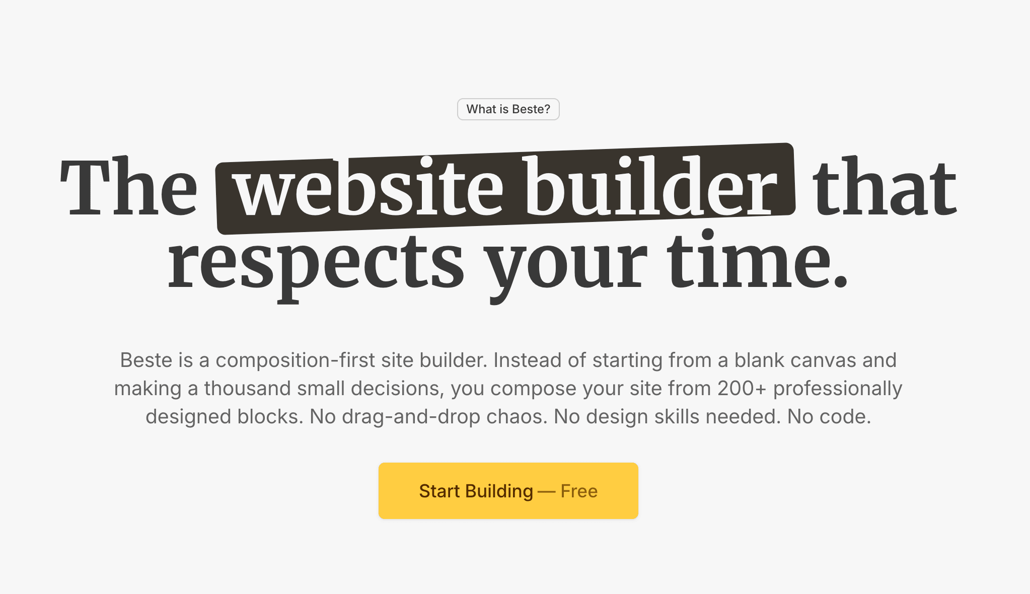
Great copy deserves a great site
Beste gives you professional blocks that work together. You focus on the words. The design handles itself.
Features vs. Benefits: The Critical Difference
This is where most copy goes wrong.
Features are what your product has. 200+ templates. Drag-and-drop editor. SSL included.
Benefits are what the customer gets. A professional site without design skills. A website you can update yourself. Security without extra cost.
Features tell. Benefits sell.
Here is the test: Can you add "so that you can..." to your statement?
- "We have 200+ templates" → "so that you can... find one that fits your business"
- "Includes drag-and-drop editor" → "so that you can... build without learning code"
- "SSL included" → "so that you can... keep customer data secure"
The "so that you can" part is the benefit. That is what belongs in your copy.
The formula: [Feature] so you can [benefit] without [pain point]
- "Pre-designed blocks so you can launch faster without hiring a designer."
- "Built-in SEO tools so you can rank higher without learning technical optimization."
- "Free custom domain so you can look professional without extra fees."
Every feature has a benefit. Find it. Lead with it.

Writing for Different Awareness Levels
Not every visitor arrives at the same starting point. Some know exactly what they need. Some are just beginning to explore.
Unaware: They do not know they have a problem yet. These visitors need education. Content that identifies problems they might not have articulated.
Problem Aware: They know the problem but not the solutions. These visitors need to understand their options. Comparison content. "How to" guides.
Solution Aware: They know solutions exist but not your specific offering. These visitors need to understand why you specifically. Differentiators. Proof.
Product Aware: They know your product but have not decided. These visitors need reassurance. Testimonials. FAQ. Risk reduction.
Most Aware: They are ready to buy. These visitors need a clear path. Prominent CTA. Simple process.
Your homepage needs to speak to multiple awareness levels. Your landing pages can be more targeted.
Match your copy to where visitors are in their journey. Selling hard to unaware visitors fails. Being too educational with ready-to-buy visitors wastes their time.
Words and Phrases to Avoid
Some words have been so overused in marketing that they have lost all meaning. They signal "generic marketing copy" and cause visitors to tune out.
Buzzwords that say nothing:
- Innovative
- Cutting-edge
- Best-in-class
- World-class
- Revolutionary
- Synergy
- Leverage
- Solutions
Vague claims that could apply to anyone:
- High quality
- Great customer service
- Affordable prices
- Professional results
- Trusted by thousands
Hype that creates skepticism:
- The best
- The only
- Amazing
- Incredible
- Mind-blowing
What to use instead:
Replace buzzwords with specifics. Instead of "high quality," describe what makes it high quality. Instead of "affordable," give a price or price range. Instead of "trusted by thousands," say "trusted by 2,847 small businesses."
Specificity is more believable than superlatives. "Loads in 1.2 seconds" is more convincing than "blazing fast." "87% of customers renew" is more compelling than "customers love us."
The Voice and Tone Question
How should your copy sound? Professional? Casual? Friendly? Authoritative?
The answer depends on your audience and your brand, but here are principles that work broadly:
Write like you talk. Read your copy out loud. If it sounds stilted or unnatural, rewrite it. If you would not say it in conversation, do not write it on your website.
Use contractions. "You'll get" instead of "You will get." "We're here" instead of "We are here." Contractions feel natural. Avoiding them feels formal and distant.
Avoid jargon unless your audience uses it. If you sell to developers, technical terms are fine. If you sell to small business owners, plain language wins.
Be direct. Do not hedge. "This might help you" is weak. "This helps you" is confident. Confidence is persuasive.
Match the moment. Your homepage can be warm and inviting. Your checkout page should be clear and reassuring. Your error messages should be helpful and calm. Tone shifts based on context.
Social Proof That Actually Works
Testimonials are powerful. Bad testimonials are useless.
What makes a testimonial effective:
Specificity. "Sarah helped me grow my revenue by 40%" beats "Sarah is great!"
Named attribution. "John Smith, Founder of Acme Co." beats "J.S." or "Anonymous"
Relevance. Testimonials from people similar to your target audience. A testimonial from a Fortune 500 CEO does not help if you sell to freelancers.
Outcome focus. What result did they get? What problem was solved?
Bad testimonial: "Great service, highly recommend!" Good testimonial: "I launched my site in three hours. No tutorials needed. My clients now think I hired an expensive agency." — Maria Santos, Freelance Consultant
Other forms of social proof:
- Client logos (if recognizable)
- Number of customers or users
- Reviews from third-party platforms
- Media mentions
- Case studies with specific results
- "As seen in" logos
The key with all social proof: it must be believable. Fake-sounding testimonials hurt more than no testimonials. Start with a few genuine, specific quotes rather than many generic ones.

Handling Objections in Copy
Every visitor has doubts. Your copy should address them before they become barriers.
Common objections and how to handle them:
"Is this too expensive?" Show value clearly. Compare to alternatives. Offer guarantees. "Less than the cost of one client dinner" reframes price.
"Will this work for my situation?" Be specific about who it is for. Use testimonials from similar customers. Address edge cases in FAQ.
"Is this trustworthy?" Social proof. Credentials. Third-party validation. Transparent policies. Real contact information.
"Is this too complicated?" Show simplicity. Screenshot the process. Explain in steps. Testimonials about ease of use.
"What if it does not work?" Money-back guarantees. Free trials. Low-commitment starting points.
Where to address objections:
- In subheadlines and supporting copy
- In a dedicated FAQ section
- In testimonials (let customers address them)
- Near the call to action (final reassurance)
You cannot overcome every objection for every person. But you can address the most common concerns directly in your copy.
The Editing Process
First drafts are supposed to be bad. Good copy comes from editing.
My editing process:
First pass: Cut ruthlessly. Remove every word that is not necessary. If a sentence works without an adjective, remove the adjective. If a paragraph works without a sentence, remove the sentence.
Second pass: Simplify. Replace complex words with simple ones. Break long sentences into short ones. Remove jargon.
Third pass: Strengthen verbs. Replace weak verbs with strong ones. "Utilize" becomes "use." "Facilitate" becomes "help." "Is able to" becomes "can."
Fourth pass: Read aloud. Anything that sounds awkward gets rewritten. Anything that makes you stumble gets simplified.
Fifth pass: Check the "you" count. Make sure the copy focuses on the visitor, not on you.
Good questions to ask:
- Would I say this in a conversation?
- Does this sentence earn its place?
- Is this specific or vague?
- What would I cut if I had to cut 20%?
Most web pages have 30-50% more words than they need. Tight copy performs better.
Putting It All Together
Let me show you how these principles combine.
Before (typical website copy):
"Welcome to ABC Company. We are a leading provider of innovative solutions for businesses of all sizes. Our team of dedicated professionals is committed to excellence and delivering world-class results. With years of experience and a passion for what we do, we are your trusted partner for success. Contact us today to learn more about how we can help your business thrive."
After (applying these principles):
"Get your website live this weekend. Pick from 200+ pre-designed blocks. Add your content. Publish. No design skills needed. No code. No frustration.
Join 2,847 small business owners who stopped fighting with complicated website builders.
Start building free →"
Same purpose. Completely different effect.
The first version is about the company. The second is about the visitor. The first is vague. The second is specific. The first has no clear action. The second drives toward a goal.
This is the difference good copy makes.
Final Checklist
Before you publish any website copy, run through this:
Clarity
- Is it immediately clear what you offer?
- Would a stranger understand this?
- Have you avoided jargon and buzzwords?
Focus
- Is this about the visitor, not about you?
- Does every sentence serve a purpose?
- Have you cut everything unnecessary?
Specificity
- Are claims backed by specifics?
- Are benefits concrete, not vague?
- Is there real proof, not just assertions?
Action
- Is there a clear next step?
- Does the CTA describe an outcome?
- Is it easy to take action?
Voice
- Does this sound like a human wrote it?
- Would you say this in conversation?
- Is the tone appropriate for your audience?

The Bottom Line
Good website copy is not about clever words or persuasion tactics. It is about clarity. It is about understanding what your visitors need and communicating how you can help.
The goal is not to convince people to buy something they do not need. The goal is to help people who do need what you offer understand that clearly and take the next step confidently.
When your copy does this well, conversion happens naturally. Not because you tricked anyone, but because you communicated effectively.
"The best copy does not feel like copy. It feels like someone finally explained things clearly."
Write for humans. Be specific. Focus on them, not you. The conversions will follow.