
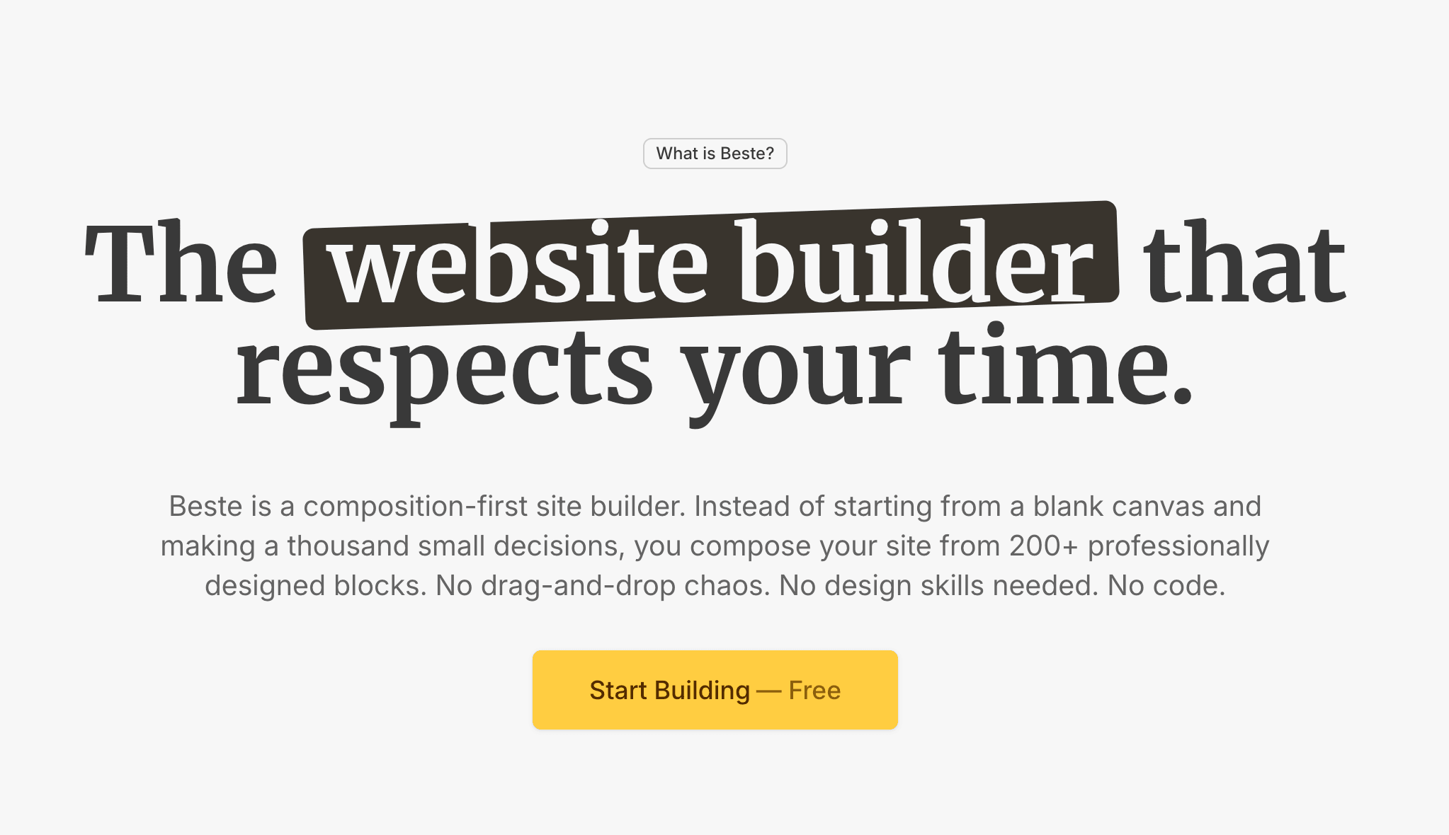

8 Homepage Trends That Actually Work in 2026
Clear headlines, faster load times, social proof up front. Eight homepage trends actually converting in 2026, based on real results, not design awards.


Every year, someone declares a design trend "dead" while another becomes the next big thing. Most of these predictions are noise. They come from designers looking at other designers, not from watching what actually converts.
I spend my days reviewing websites, analyzing what works, and helping businesses communicate better. Here is what I am actually seeing work on homepages in 2026. Not what looks cool on Dribbble. What gets results.
1. The Hero Says One Thing, Clearly
The days of clever, cryptic headlines are fading. The homepages that perform best in 2026 state exactly what the business does in plain language.
Not "Empowering Your Digital Journey." Not "Innovation Meets Excellence."
Instead: "Accounting software for freelancers." Or: "We design websites for restaurants."
Why this works: Visitors decide in seconds whether to stay or leave. Clever headlines make them work to understand you. Clear headlines let them instantly self-qualify.
The pattern I see on high-converting homepages: specific headline, supporting subheadline with key benefit, one obvious call to action. No mystery. No metaphors.

2. Social Proof Moved Up
Social proof used to live at the bottom of the page. Scroll past the features, past the benefits, and maybe you would find some testimonials.
In 2026, the best homepages put social proof near the top. Often immediately after the hero section. Sometimes within it.
What this looks like:
- Customer logos right below the headline
- A testimonial quote in the hero area
- "Trusted by X customers" as part of the opening
- Star ratings visible without scrolling
Why this works: Trust is the first barrier. Visitors want to know others have used you before they invest attention in learning more. Moving social proof up answers "can I trust this?" earlier.
This does not mean stuffing your hero with logos. It means one or two trust signals visible immediately. The rest can come later.
3. Less Navigation, More Focus
I am seeing successful homepages reduce navigation items significantly. Five items maximum. Sometimes three.
The old approach: mega menus with every possible page linked. The 2026 approach: only the essential paths, everything else discoverable elsewhere.
Why this works: Every navigation item is a decision. More decisions create friction. Focused navigation guides visitors toward what actually matters.
Some high-converting sites go further with campaign-specific landing pages that remove navigation entirely. One page, one goal, no escape routes.
The principle: Your homepage is not a sitemap. It is a guided path. Reduce the paths, increase the clarity.

4. Speed Over Spectacle
This trend has been building for years, but 2026 is where I see it becoming standard: performance beats visual effects.
The homepages that convert best load fast. Under two seconds. Often under one.
What is disappearing:
- Auto-playing video backgrounds
- Heavy animation libraries
- Massive hero images that take seconds to load
- Parallax effects on every scroll
What is replacing it:
- Optimized images in modern formats
- Subtle CSS animations instead of JavaScript-heavy effects
- Static hero images or lightweight motion
- Core Web Vitals as a design constraint
Why this works: Google measures page speed. Visitors feel page speed. A beautiful homepage that takes four seconds to load loses visitors before they see the beauty.
I see more businesses treating performance as a feature, not a technical afterthought. The constraint of speed often produces cleaner, more focused designs.
5. Outcome-First Messaging
Features are fading from homepage prominence. Outcomes are taking their place.
Feature-first (old approach): "AI-powered analytics dashboard with real-time reporting and customizable widgets."
Outcome-first (2026 approach): "See which marketing channels actually make you money."
The best homepages I review lead with what the customer gets, not what the product has. Features still exist, but they support the outcome story rather than lead it.
The framework I see working:
- Headline states the outcome
- Subheadline hints at how
- Body copy provides proof
- Features appear as supporting evidence
This is not new advice. What is new is how consistently the top-performing homepages follow it. The gap between outcome-focused and feature-focused messaging is widening.

6. The Return of Long-Form Homepages
For a while, minimalism pushed homepages to be extremely short. Hero, three features, CTA, done.
In 2026, I am seeing effective homepages get longer again. Not bloated. Intentionally comprehensive.
What long-form homepages include:
- Clear hero with value proposition
- Social proof section
- Problem/solution narrative
- Key benefits with supporting details
- How it works explanation
- More detailed testimonials or case studies
- FAQ section
- Final call to action
Why this works: A well-structured long page keeps visitors engaged and answers objections before they arise. Visitors who scroll through a complete story arrive at the CTA more convinced than those who saw only a headline.
The key word is "well-structured." Long and rambling fails. Long and intentional converts. Each section earns its place by serving a purpose in the visitor's decision journey.
7. Specific Numbers Over Vague Claims
Vague claims are losing power. Specific numbers are gaining it.
Vague (losing effectiveness):
- "Trusted by thousands"
- "Industry-leading results"
- "Significant time savings"
Specific (working in 2026):
- "Trusted by 2,847 small businesses"
- "Average 34% increase in conversions"
- "Setup takes 11 minutes"
Why this works: Specific numbers feel researched. They suggest you actually measured something. Vague claims feel like marketing. Everyone says them. They mean nothing.
I am seeing this extend beyond testimonials into all homepage copy. Pricing pages show exact prices instead of "contact for quote." Time estimates give minutes instead of "quick setup." Results show percentages instead of "improved outcomes."
The principle: If you can put a number on it, do. Specificity builds trust.
8. One Primary CTA, Repeated
The homepages converting best in 2026 have one primary call to action. Not three options. Not different buttons competing for attention. One clear action, repeated at logical points throughout the page.
What I see working:
- Same CTA in the hero
- Same CTA after the benefits section
- Same CTA at the page bottom
- Consistent button text throughout
What I see failing:
- "Start Free Trial" competing with "Book a Demo" competing with "Learn More"
- Different actions at different scroll points
- Buttons that change text ("Get Started" then "Sign Up" then "Create Account")
Why this works: Decision simplicity. When there is only one thing to do, doing it becomes easier. Multiple options create hesitation. Hesitation kills conversion.
The secondary actions still exist. They just visually defer to the primary action. A text link to "Book a Demo" below a prominent "Start Free Trial" button works. Two equally prominent buttons fighting for attention does not.
Build a homepage that converts
Blocks designed with these trends built in. Clear messaging, fast loading, focused CTAs. Ready in hours.
What These Trends Have in Common
Looking at these eight trends together, a clear theme emerges: clarity over cleverness.
Every trend points toward making things simpler, faster, and more obvious for visitors:
- Clear headlines over cryptic ones
- Trust signals up front
- Fewer navigation choices
- Faster loading
- Outcomes over features
- Comprehensive but structured content
- Specific numbers over vague claims
- One action instead of many
This is not about dumbing things down. It is about respecting visitor attention. People are busy. They have options. Homepages that communicate clearly and quickly win.
What I Am Not Seeing Work
A few things that seemed trendy but are not converting well:
AI-generated imagery everywhere. Visitors are developing an eye for it. Generic AI images feel less trustworthy than real photos or quality illustrations.
Chatbots as the first interaction. Popup chatbots before visitors orient themselves interrupt rather than help. The best implementations make chat available but not aggressive.
Dark mode as default. Some audiences prefer it, but forcing dark mode without a toggle alienates visitors who find it harder to read. Let users choose.
Scroll-jacking. Taking control of how visitors scroll still frustrates more than it impresses. Let people scroll normally.
Applying This to Your Homepage
You do not need to implement all eight trends. Start with the ones where you have the biggest gaps.
Quick audit questions:
- Does your headline clearly state what you do and for whom?
- Is there social proof visible without scrolling?
- Could you remove half your navigation items?
- Does your homepage load in under two seconds?
- Does your copy lead with outcomes or features?
- Does your page structure guide visitors through a complete story?
- Are your claims backed by specific numbers?
- Do you have one clear primary CTA?
Any "no" answer is an opportunity.

Finally...
Trends come and go. What stays constant is this: homepages exist to help visitors understand what you offer and decide if it is right for them.
The trends working in 2026 all serve that goal. They remove friction. They build trust faster. They communicate more clearly.
Your homepage does not need to be trendy. It needs to be clear.
"The best homepage trend is the one that helps visitors say yes faster."
Focus on clarity. The conversions will follow.