

Above the Fold: What to Put There and Why It Matters
Above the fold is the most valuable real estate on your site. Here's what belongs there, what does not, and why the rules have changed in 2026.


The phrase "above the fold" comes from newspapers. Editors put the most important story on the top half of the front page, because that was the only part visible when papers were folded and stacked at the newsstand. Online, the phrase carries the same meaning: the part of the page a visitor sees before they scroll.
That part of the page is the most expensive real estate on the entire web. It is the only section guaranteed to be seen by 100 percent of visitors. Everything below it is optional; visitors choose to scroll, and many do not. What you put above the fold determines whether they choose to keep reading or leave.
This is also the section most often wasted. Pages crowd it with logos, navigation menus, hero images that take half the screen, and headlines that say nothing. By the time the visitor sees anything that matters, they have already decided. This article is about doing the section right.
What "Above the Fold" Actually Means in 2026
The simple definition still holds: anything visible without scrolling. But in 2026, that definition has more variables than it used to.
Consider the range of devices and viewports:
- A visitor on a 27-inch desktop monitor sees a much taller above-the-fold area than someone on an iPhone
- A visitor on a Mac with the browser nearly full-screen sees more than someone on a Chromebook with a small viewport
- The fold is not a fixed line; it is a range that depends on device, browser, operating system, and user settings
For practical purposes, this means designing for the smallest realistic viewport, not the largest. If your hero looks great on a 1920-pixel desktop and disappears on a phone, you have designed for the wrong audience.
More than half of landing page traffic in 2026 is mobile, and on mobile, the fold is roughly 600 pixels of vertical space. That is your real budget.
What Has to Be Above the Fold
Four things, in order of importance.
1. The headline
The single most important element. A visitor who reads only the headline should be able to answer two questions:
- What is this?
- Is it for me?
If they can answer both, they keep scrolling. If they cannot answer either, they leave.
Headlines that work in 2026 are specific and benefit-led:
| Weak headline | Strong headline |
|---|---|
| AI-powered project management | Project management for software teams shipping weekly |
| The future of collaboration | Shared docs for remote product teams |
| Revolutionary accounting software | Close your books in 2 days instead of 10 |
The headline should be the largest text on the page, full stop. Nothing else competes for visual weight.
2. The supporting subheadline
Below the headline, one line that adds the specificity the headline could not carry. This is where you handle the first objection or add the credibility detail.
Examples of headline + subheadline pairs that work:
Headline: Project management for software teams shipping weekly Subheadline: Built on the same workflows used at GitHub, Linear, and Vercel
or:
Headline: Build your website in an afternoon Subheadline: No drag-and-drop, no AI prompts, no design skills needed
The subheadline does the work of preventing the bounce. The headline made them curious; the subheadline keeps them from leaving.
3. The primary call to action
One button, with copy that names the specific outcome the visitor will get:
- ❌ "Learn More"
- ❌ "Get Started"
- ✅ "Start your free trial"
- ✅ "See how it works"
For deeper treatment of CTA copy, we wrote a separate piece on call-to-action language that converts.
The CTA needs to be unambiguous. A visitor scanning the section should immediately know what the page is asking them to do.
4. Visual confirmation of what the product is
This is often a screenshot, a short product demo, or an image showing the actual thing in use.
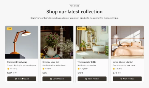
Not an abstract illustration. Not a stock photo of people in a meeting. Something that makes the product real.
The visual is doing the job of "show, do not tell." A screenshot of the actual interface is worth a hundred words of feature description. If the product is too abstract for a screenshot (a service business, for example), the visual job falls to a real photograph of real work happening.

What Should Not Be Above the Fold
Just as important as what to include is what to leave out. The above-the-fold section should be ruthless about its own real estate.
✗ Long navigation menus
If your nav has fifteen items, you are spending the visitor's first attention on links to your blog. A focused page has minimal nav: logo, three or four critical links, and the CTA repeated as a button.
✗ Decorative imagery that does not explain
Background patterns, abstract graphics, generic stock photos. If a visual does not make the value proposition more real, it is taking space that should belong to the message.
✗ Multiple competing CTAs
"Start free trial" next to "Watch demo" next to "Contact sales" splits attention three ways. Pick one. Other paths can exist below the fold or in nav.
✗ Long body paragraphs
The above-the-fold section is for compressed, high-impact content. A paragraph of explanation belongs below the fold where the visitor has chosen to engage. Up top, less is more.
✗ Cookie banners covering half the screen
This is a regulatory reality, not a design choice, but where you have control over the design of the banner, keep it small and dismissible. A cookie wall blocking the hero is a self-inflicted wound.
✗ Trust badges and certifications scattered everywhere
These belong in the proof section below the fold, where they have context. Up top they look like badges of insecurity.
✗ Auto-playing videos with sound
Almost universally hated and almost always removed within months of launch. Skip the lesson and leave them off from the start.
The Hierarchy That Works
A reliable layout for the above-the-fold section, in 2026:
- Logo and minimal nav at the top (small, unobtrusive)
- Headline (largest text on the page)
- Subheadline (smaller, one line, addresses the next question)
- Primary CTA button (visually distinct, action-oriented copy)
- Friction-reducer text near the CTA ("No credit card required" or similar)
- Visual element (product screenshot or demo, taking the right side or below the CTA depending on layout)
That is the entire section. Six elements, each doing one job.
Pages that try to fit ten things above the fold do all of them poorly. Pages that fit six well outperform.
Mobile Above the Fold Is Different
On mobile, the fold is much shorter, and the elements stack vertically instead of sitting side by side. The hierarchy still applies, but the budget is tight.
Mobile-specific hierarchy
- Logo only at top, no nav (tucked into a hamburger menu)
- Headline (still large, but proportional to viewport)
- Subheadline (kept short, ideally one line that wraps to two)
- Primary CTA button (full width, easy to tap)
- Friction-reducer text below button
The visual element often gets pushed below the fold on mobile, which is fine. The visual is a confirmation, not a primary message. As long as the headline, subheadline, and CTA fit in the visible area, the section is doing its job.
This is part of why responsive design matters as a foundational platform decision, not an afterthought. We covered this distinction in what nobody tells you about responsive design. Builders that handle responsive design automatically (block-based systems, mostly) save you from the constant fight of redesigning your hero for each viewport.
The Five-Second Test
The standard way to evaluate whether your above-the-fold section is working is the five-second test.
How to run it
- Show the page to someone who has never seen it before
- Wait exactly five seconds
- Hide it
- Ask three questions
The three questions
- What does this product or service do?
- Who is it for?
- What action does the page want you to take?
How to score it
| Answers correct | Verdict |
|---|---|
| All three | Your section is working. |
| One or two | You have a partial fix to make. |
| None | You have rebuilding to do. |
Most pages fail this test. The fix is almost always the same: cut something, sharpen the headline, make the CTA more specific.
You can run this test informally with friends, colleagues, or anyone willing to look. There are also paid services (UsabilityHub, PlaybookUX) that run it with strangers if you want unbiased feedback.

What Has Changed Since 2020
A few specific shifts worth knowing about, because old advice on this topic is everywhere and some of it is now wrong.
Hero videos have lost favor
Five years ago, autoplaying hero videos were the trend. They were never great for conversion, and they aged poorly. Most pages now use a static screenshot or a small interactive demo loop. Real product imagery beats glossy abstract video.
Long-scroll homepages have replaced multi-page sites for many use cases
When a single scroll can hold your full pitch, the above-the-fold section is doing the job of "earning the scroll" rather than "convincing the click to a different page." This shift makes the hero matter more, not less.
Mobile-first thinking is the default
Designing the desktop hero first and adapting it to mobile is now backwards. Most modern teams design the mobile experience first and let it expand naturally to desktop. This produces hero sections that work everywhere, instead of hero sections that work on desktop and fall apart on phones.
Loading speed is now part of the hero
A beautifully designed hero that takes 4 seconds to render fails before it has a chance to convert. Modern edge hosting and clean code matter as much as the visual design itself.
Accessibility is no longer optional
Four things that are now table stakes:
- Color contrast
- Text readable at default sizes
- Keyboard navigation
- Screen reader compatibility
Beyond the moral case, accessibility is increasingly tied to legal requirements and SEO signals.
Common Above-the-Fold Mistakes
After reviewing many pages, the same mistakes show up over and over.
1. Headlines that describe the company instead of the visitor's outcome
- ❌ "We help teams collaborate better" (about you)
- ✅ "Stop losing context between meetings" (about them)
2. Stock photos of generic happy people
A diverse team smiling at a laptop adds nothing and signals that you do not have anything specific to show. Real product, real photography, or no image at all.
3. CTAs hidden in surrounding content
A button that blends into the background, sits below the fold, or competes with three other buttons is wasted. The primary CTA should be the most visually prominent action on the page.
4. Walls of text where there should be a single message
If your hero has a paragraph instead of a headline plus subheadline, the visitor is doing reading work before they have decided whether the page is worth it. Compress.
5. Animations that delay the visible content
Fade-ins, slide-ups, complex entrance choreography. These look impressive in mockups and frustrate real visitors. The hero content should be visible the instant the page paints.
6. Heroes that work on the design team's monitors but not on customer devices
A hero designed at 1920 pixels and never tested at 375 pixels (iPhone width) will look bad for half your visitors. Always test on real devices, not just browser dev tools.
Quick Audit for Your Hero
Run through these questions on your current hero section. Each "no" is something to fix.
- Can someone read the headline and immediately know what you do and who it is for?
- Does the subheadline add specific information the headline could not carry?
- Is there exactly one primary CTA?
- Is the CTA copy specific to the outcome (not "Learn More" or "Get Started")?
- Is there a friction-reducer near the CTA ("No credit card needed" or similar)?
- Does the visual element show your actual product or work?
- Does the section load and become visible in under 2 seconds?
- Does it work on a phone-sized viewport without anything important getting cut off?
- Is there one clear visual hierarchy where the headline is the largest element?
- Have you cut everything that does not serve one of the four core jobs?
A hero that passes all ten will not guarantee high conversion, but it will not be the reason you lose visitors. The other parts of the page can build from there.
For the rest of the page architecture, our complete landing page best practices guide covers what comes after the hero.