
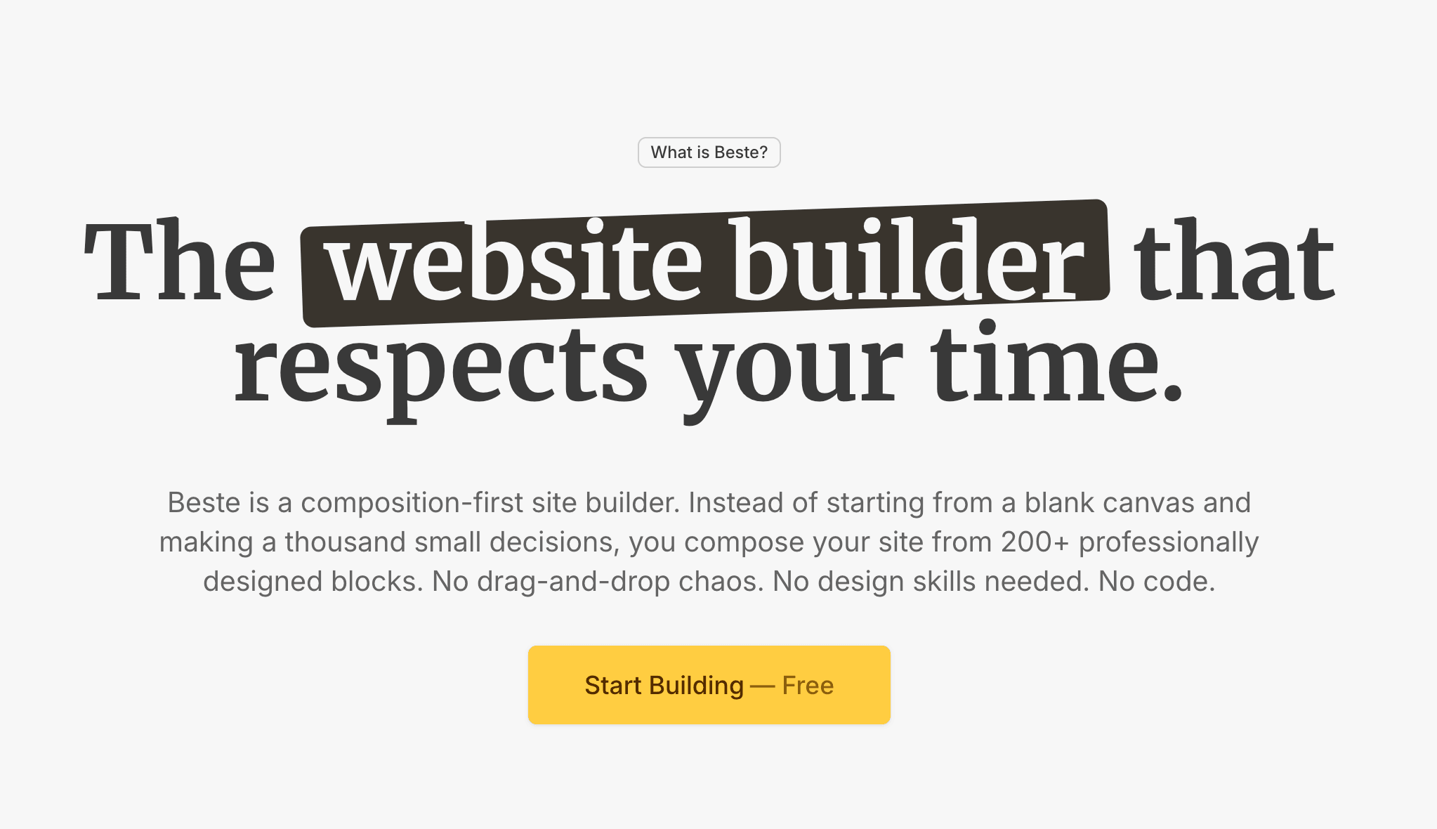

Landing Page Best Practices: The Complete Guide to Pages That Convert
Most landing page advice is vague. This is a concrete guide to what actually makes a page convert, with the underlying principles behind every recommendation.


Landing pages are the one piece of a website where the gap between "looks good" and "works" is widest. A page can be beautifully designed, technically perfect, and still convert at 0.4 percent. Another page can look plainer, load in the same time, and convert at 8 percent. The difference is almost never the thing that jumps out visually. It is the underlying logic.
This guide is not a feature checklist. Feature checklists exist everywhere and they repeat the same surface advice:
- Clear headline
- Visible call to action
- Social proof
- Mobile-friendly
All of that is true, and all of it is also incomplete. Two pages can follow every item on such a list and produce wildly different results.
What follows is a more honest framework. We will walk through what a landing page actually has to do, the decisions that determine whether it does it well, and the specific patterns that work in 2026. By the end, you should be able to look at any landing page (yours or someone else's) and diagnose why it is or is not converting.
What a Landing Page Actually Does
A landing page has one job.
Make a specific visitor take a specific action.
That sentence sounds obvious, but the word "specific" is doing most of the work. A landing page is not your homepage. It is not trying to serve everyone who might visit your site. It is trying to serve one kind of visitor, arriving with one kind of need, and get them to do one thing.
This is the distinction most broken landing pages miss. They try to:
- Explain the whole company
- Appeal to multiple audiences
- Offer three different actions (sign up, learn more, contact sales)
They end up doing none of them well. For the difference between homepages and landing pages, we wrote a separate piece on when each belongs that is worth reading alongside this one.
The specific job of a landing page is to take a visitor from "interested but uncertain" to "action taken" in under a minute. Everything else is supporting that job. Every design decision, every word, every image earns its place by contributing to that outcome or gets cut.
The Six Decisions That Determine Whether Your Page Converts
Before we get into specific tactics, the six decisions that actually matter. These are the levers that move the numbers. Everything else (color, font, animation, minor copy tweaks) has dramatically less impact than any one of these.
Decision 1: Who is the page for?
Not "founders and marketers." Not "small businesses." Those are categories, not people.
The pages that convert name a specific person:
| Too general | Specific enough to convert |
|---|---|
| "For businesses that want better reporting" | "For finance teams drowning in month-end reports" |
| "For modern companies" | "For 10-to-50 person SaaS teams shipping weekly" |
| "For everyone who needs a website" | "For founders launching in 2 weeks without a designer" |
The first version in each row tells everyone they might be in the right place, which is a weaker signal. The second tells one kind of person they are in the right place.
Before writing anything else, write one sentence:
This page is for [specific role] who is trying to [specific goal] but currently has to [specific pain].
If you cannot complete that sentence in a way that feels true, your page will not convert. Fix the targeting first.
Decision 2: What promise are you making?
A landing page makes one promise. Use our tool, get this outcome. Buy this product, solve this problem. Join this list, receive this thing.
The promise needs to be specific enough to believe and compelling enough to matter:
- ❌ "Better reports" → too vague
- ✅ "Close your books in 2 days instead of 10" → a real promise
One is generic benefit language; the other is a claim you can evaluate.
If you can compress your promise to a single sentence that a reasonable person would trade their email address or credit card for, you have a landing page. If you cannot, you have a brochure.
Decision 3: What does the visitor need to believe to act?
This is the decision most pages skip, and it is the most important one.
For a visitor to take action, they have to believe several things. Each of those beliefs is a potential blocker:
- That the promise is real
- That it applies to them
- That the cost (money, time, effort) is worth it
- That now is the right time
- That this option is the right one
A good landing page identifies which beliefs are weak for the target visitor and addresses them head-on.
| Company stage | Weakest belief usually |
|---|---|
| Startup, unknown brand | "I've never heard of you, can I trust you?" |
| Category leader | "Is this worth the money?" |
| Established with mixed reviews | "Are the bad reviews I saw representative?" |
| Complex technical product | "Will this actually integrate with what I have?" |
List the beliefs your visitor needs to hold. Then check each section of your page: is it building one of those beliefs or not? If not, cut it.
Decision 4: What is the action?
One action. Not three. Not even two in most cases.
This is the single most consistent piece of research in conversion optimization: pages with multiple competing calls to action convert worse than pages with one. Every additional option adds cognitive load and dilutes the commitment you are asking for. For a deeper treatment of why this works this way and what strong CTAs actually look like, see how to write a call to action that people actually click.
Pick one primary action. Make every section of the page support that action. If you feel like you need a secondary action, reconsider whether the page is actually one page or should be two.
Decision 5: Where is the visitor coming from?
A landing page visitor arriving from a Google ad for "best accounting software for freelancers" is in a different headspace than one arriving from a Twitter post about your launch:
| Traffic source | Visitor state |
|---|---|
| Paid ad for specific keyword | Stated intent, ready to evaluate |
| Social media launch post | Curiosity, browsing mode |
| Email newsletter | Warm, context from the email |
| Partnership/podcast mention | Trust borrowed from the referrer |
| Organic search | Specific problem in mind |
The same page will not serve all of these well.
If your traffic comes from multiple sources with meaningfully different contexts, you likely need multiple landing pages. This is not a small optimization; it is often the difference between a 2 percent page and an 8 percent page. Match the message on the page to the context the visitor arrived with.
Decision 6: How fast does the page load?
Not a decision exactly, but a foundational reality. Pages that take longer than 3 seconds to load lose a large percentage of visitors before they see anything. Core Web Vitals are the standard way to measure this, and they have real effects on both visitor behavior and search rankings.
This decision is made at the platform level more than at the page level:
- A landing page built on a slow platform cannot be fast no matter how well you optimize the content
- A landing page built on modern edge infrastructure is fast by default
If you are building landing pages seriously, this is one of the reasons platform choice matters.

The Anatomy of a High-Converting Landing Page
With the decisions framed, here is the structure that works for most landing pages in 2026. This is not the only structure, but it is the one that handles the most situations well.
The hero section (above the fold)
The hero is the single most important part of the page. Most visitors read it and decide in seconds whether to keep scrolling or leave. Everything below the fold matters only if the hero earned the scroll.
A hero needs four things:
- A clear headline that makes the promise
- A subheadline that adds specificity or addresses the first objection
- A single primary call to action
- One supporting visual element
That is it. The pages that convert do not have more than this; they have less, refined.
The headline should pass a simple test: a stranger reading only the headline should understand what you offer and who it is for.
- ❌ "Collaboration software" → fails this test
- ✅ "Shared docs for remote product teams" → passes it
The subheadline does the work the headline cannot. Often this is where you handle the first objection ("no credit card required"), add specificity ("under 5 minutes to set up"), or name the audience explicitly if the headline could not.
The CTA should use action language that matches the visitor's mental state:
- "Start free" → works for someone ready to act
- "See how it works" → works for someone still evaluating
- "Get in touch" → rarely the right choice unless you are selling a service with genuine handholding requirements
The visual element is support, not decoration. A product screenshot that shows the actual thing works better than an abstract illustration. If a hero visual does not make the promise more real or more believable, it is probably hurting conversion, not helping.
For much more detail on the hero and what belongs there, we wrote a dedicated piece on what to put above the fold and why it matters.
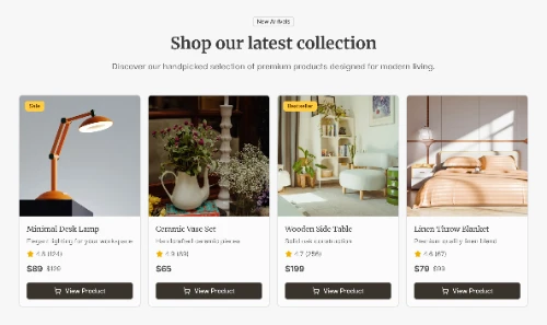
The value proposition section
Immediately below the hero, the page needs to expand on the promise. Not with features, but with outcomes. What does the visitor get out of using this thing?
The pattern that works: three to five specific outcomes, each in 10 to 20 words, each focused on the visitor's life not the product's features.
| Features dressed as benefits | Real outcomes |
|---|---|
| "CRM with pipeline management" | "Close deals faster" |
| "AI-powered analytics dashboard" | "See exactly which marketing spend is working" |
| "Enterprise-grade security features" | "Pass your next compliance audit without stress" |
A common mistake here is writing outcomes the company cares about instead of outcomes the visitor cares about:
- ❌ "Scale your revenue" → what the company wants
- ✅ "Stop losing deals to slow follow-up" → what the sales manager wants
Use their language, not yours.
Our guide on how to write website copy that converts goes deeper into this shift from company-centric to visitor-centric writing, and it is worth reading before you draft any landing page copy.
The proof section
After the promise and the outcomes, the visitor is asking a silent question:
Is any of this actually true?
This is where proof goes.
Proof takes several forms, and the strongest landing pages stack multiple kinds:
1. Specific results "Used by 14,000 teams" is generic. "Helped Acme Corp reduce support ticket volume by 34 percent in 90 days" is specific. Numbers with names beat numbers without names.
2. Recognized logos Customer logos work, but only if the visitor recognizes enough of them to feel something. A wall of unfamiliar logos is worse than no logos, because it signals "we have customers but you have not heard of them."
3. Individual testimonials with real context
- ❌ "Sarah K., Marketing Manager"
- ✅ "Sarah Kim, VP Marketing at Gusto, who used the product to ship their new campaign system in 6 weeks"
Roles, companies, and specifics make testimonials believable.
4. Third-party validation Press coverage, G2 or Capterra ratings, industry awards. These work best when the source is recognizable and the claim is specific.
Avoid what we call decorative proof: generic star ratings without context, "trusted by leading companies" with no logos, vague customer counts ("thousands of users"). These decrease conversion because they feel performative without being substantive. For more on which kinds of social proof actually move conversion and which feel fake, we covered this in social proof on your website: what works and what feels fake.
The how-it-works section
Depending on your product's complexity, this section explains mechanics:
- Three to five steps
- Each shown visually if possible
- Each in simple language
This section is most important when the product does something the visitor might not intuitively understand:
| Situation | Need this section? |
|---|---|
| New category of tool | Yes, prominently |
| Established category with differentiation | Brief version |
| Self-serve SaaS | Yes |
| Enterprise sales motion | Often handled in demo instead |
The test for whether this section is working:
After reading it, does the visitor know enough to feel confident taking the action?
If yes, leave it. If no, either expand it or consider that the visitor may not be the right target for this landing page in the first place.
The objection-handling section
Every product has objections:
- Price
- Time investment
- Switching cost
- Skepticism about claims
- Worry about integration
- Worry about support
Good landing pages surface and address these explicitly.
This is often done as an FAQ, but the format matters less than the content. Pick the three to five objections you actually hear from prospects and answer them honestly on the page. The goal is to handle the objection before the visitor has to ask, because most visitors will not ask; they will just leave.
Honest handling matters. Dodging an objection makes it worse:
- ❌ "Is it easy to set up?" → "Our onboarding process is streamlined." (worse than no answer)
- ✅ "Setup takes 15 to 30 minutes for most teams, and we have a free migration service if you have more than 1,000 existing records." (an actual answer)
The final call to action
At the bottom of the page, one more explicit invitation to act. Same CTA as the hero, possibly slightly different copy that acknowledges the visitor has now read the page:
- Top: "Start free trial"
- Bottom: "Ready to try it? Start your free trial"
A surprising number of pages forget this section. The visitor scrolls through the whole page, builds intent, and then hits the footer with no clear next step. Do not let that happen.
The Principles Behind Everything Above
The structure above works because it respects how people actually decide. Let's name the underlying principles, because they explain why the tactics work and will still apply when tactics change.
1. Specificity beats generality
Every time. At every level. In headlines, in outcomes, in proof, in CTAs. The specific version of any claim converts better than the generic version.
2. Respect the visitor's attention
Every section has to earn its place. If a section does not build belief or move the visitor toward the action, cut it. Length by itself is neutral; what matters is whether every paragraph is doing work.
3. Address objections before asking
By the time a visitor decides not to convert, they have usually decided silently without ever voicing the concern. The landing page has to anticipate and handle these concerns proactively.
4. Mirror the visitor's language
The words on the page should sound like the words the target person would use to describe their own problem. If you sound like a marketer and they are a developer, you lose.
5. One page, one job
Every attempt to expand the page's responsibilities dilutes its effectiveness. When in doubt, cut something rather than adding something.
Common Mistakes That Kill Conversion
After reviewing a lot of pages, the same mistakes appear again and again.
1. Talking about the company instead of the visitor
The first-person pronoun count on a landing page tells you a lot. Pages that say "we" more than "you" are usually underperforming.
2. Stacking competing CTAs
"Start free trial" next to "Book a demo" next to "Contact sales." Three competing actions means no one takes any of them with confidence. Pick one.
3. Generic stock imagery
Handshake photos, diverse teams around a laptop, abstract connectivity illustrations. These add nothing and often signal "we do not know what we actually do." Use real product screenshots or real photos of real work.
4. Claims without evidence
- "The best tool for X" with no data behind it
- "Loved by thousands" with no specific customers
Every claim needs either proof or reasonable believability on its own.
5. Friction in the CTA flow
- The form asks for 11 fields when 3 would do
- The signup requires credit card for a free trial
- The demo booking is a calendar link that opens in a new tab with no context
Every friction point costs you converts.
6. Pages that load slowly
Any page over 3 seconds loses visitors before they have seen the headline. This is a platform-level decision as much as a page-level one.
7. Ignoring mobile
More than half of visitors on most landing pages are on mobile. If your page was designed for desktop and merely "works" on mobile, you are leaving money on the table.
For modern block-based builders like Beste, mobile handling is automatic because blocks are designed responsively from the start. For drag-and-drop builders, mobile is a separate round of work that often gets rushed.
How to Actually Build One
Structure and principles are useful, but the actual building is where most pages go wrong. Here is the sequence that works.
Step 1: Write the headline and CTA first, on paper
Before you touch any builder, know what the page is promising and what it is asking. If you cannot write these two things compellingly, no builder will save you.
Step 2: Outline the whole page in order
Hero → value prop → proof → how it works → objections → final CTA. Write one sentence for each section describing what it needs to accomplish. This is your blueprint.
Step 3: Write the copy in a plain document
Not in a builder. In a Google Doc or Notion. Writing in a builder is a trap because you start making design decisions before the words are right, and design decisions are easier to change than the underlying message.
Step 4: Build the page on a block-based builder
This is where block-based systems are dramatically faster than drag-and-drop:
- Pick a hero block
- Add a feature block
- Add a testimonial block
- Add a CTA block
- Add a footer
Fill in your already-written copy. The design work is already done.
Step 5: Review on mobile
Before publishing, look at every section on a phone-sized viewport. If anything breaks visually or reads poorly, fix it now.
Step 6: Publish and set up analytics from day one
- Google Analytics
- Any conversion tracking you have
- Microsoft Clarity for session recordings
You cannot optimize what you cannot measure.
Step 7: Test one thing at a time
Once the page is live and has meaningful traffic, start testing. But only one variable at a time. Change the headline and leave everything else the same. Run the test for enough traffic to actually tell you something. If this part is unfamiliar, how to A/B test your landing page even if you're not a marketer walks through the basics.
For the full walkthrough of actually building one end-to-end, how to build a landing page in under 2 hours is the companion guide to this strategic overview.
When to Have Multiple Landing Pages
A common question once a first landing page is working: should you have more?
The answer is usually yes, but only if you have traffic sources with meaningfully different contexts. One page per major traffic source is a good rule.
✓ Situations that warrant separate landing pages
- Different ad campaigns targeting different pain points
- Different audience segments (freelancers vs agencies vs enterprises)
- Different product use cases (the tool for X vs the tool for Y)
- Geographic or language differences, beyond just translation
- Different referral partners whose audiences have different relationships with you
✗ Situations that do NOT warrant separate pages
- Minor keyword variations
- Pages you want to test different headlines on (do that with A/B testing, not separate pages)
- Every feature of your product (feature pages are different from landing pages)
Modern builders make having multiple landing pages trivial from a technical standpoint. The constraint is editorial: do you have the resources to maintain each page with specific, relevant content, or are you just creating more generic pages? If the latter, consolidate.

The Things That Do Not Actually Matter as Much as You Think
Three common optimization obsessions that rarely move the needle as much as people hope.
Button color
Endless blog posts have been written about whether green or red buttons convert better. In practice, the color almost never matters as much as:
- The placement
- The language
- Whether the whole page earned the click
Spend your time elsewhere.
Exact headline phrasing
| Test comparison | Signal strength |
|---|---|
| "Close deals faster" vs "Close more deals faster" | Tiny, usually noise |
| "Close deals faster" vs "Stop losing deals to slow follow-up" | Real signal, different promises |
Test meaningful variations, not cosmetic ones.
Number of bullet points
Six versus seven bullet points in your features section is noise. The content of the bullets is everything. If the bullets are specific and compelling, the count does not matter. If they are vague, no count will save them.
Your Landing Page Review Checklist
When you or a colleague finishes a landing page draft, run through these questions before publishing. If any answer is unclear or no, fix it.
- Can a stranger tell from the headline alone who the page is for and what it offers?
- Does the page make one specific promise, not several vague ones?
- Is there exactly one primary call to action?
- Are you using the visitor's language or your internal language?
- Have you addressed the top three objections explicitly somewhere on the page?
- Is the proof specific (real names, real numbers, real results) rather than decorative?
- Does every section contribute to the action, or are some sections just filler?
- Does the page load in under 3 seconds?
- Does it read well on mobile, not just work?
- Is analytics set up to measure the conversion?
A page that passes all ten will not necessarily convert well, but a page that fails any of them is almost guaranteed not to.