


How to Build a Landing Page in Under 2 Hours (Without Code or Design Skills)
A step-by-step guide to building a professional landing page in under two hours using pre-designed blocks. No coding, no templates, no design degree required.

You have a product, a side project, a freelance service, or a startup idea. You know you need a landing page. And you've been putting it off for weeks because every time you open a website builder, you end up spending three hours adjusting margins and still hate the result.
This guide is for you.
We're going to walk through building a complete, professional-looking landing page in under two hours. No code. No design background. No staring at a blank canvas wondering where to start.
The secret isn't talent or tools — it's structure. Once you know what sections a landing page needs and in what order, the rest is just filling in the blanks.
Why most people never finish their landing page
The typical experience goes something like this. You pick a template. It looks great in the preview. Then you start replacing the placeholder content with your own words and images, and the whole thing falls apart. The spacing breaks. Your headline is longer than theirs. Your logo doesn't fit. You try to move an element and it snaps to the wrong place. Two hours in, you've built half a page that looks worse than the template you started with.
This happens because most website builders give you a finished design and ask you to reverse-engineer it. The template was built by a designer who understood whitespace, typographic hierarchy, and responsive grids. You're not supposed to "fill in" someone else's design — you're supposed to build your own from parts that are already designed well.
That's the difference between a template-first approach and a block-based approach. With blocks, you're not editing a finished page. You're assembling one from pre-designed sections that already handle spacing, alignment, and responsive behavior. You pick the sections, arrange them, and focus on what actually matters: your content.
The six sections every landing page needs
Before opening any builder, you need to know the structure. A landing page isn't a website. It has one job: convince a visitor to take one action. Every section exists to support that goal.
Here's the structure that works for almost any landing page, whether you're launching a SaaS product, offering consulting services, or promoting a course.
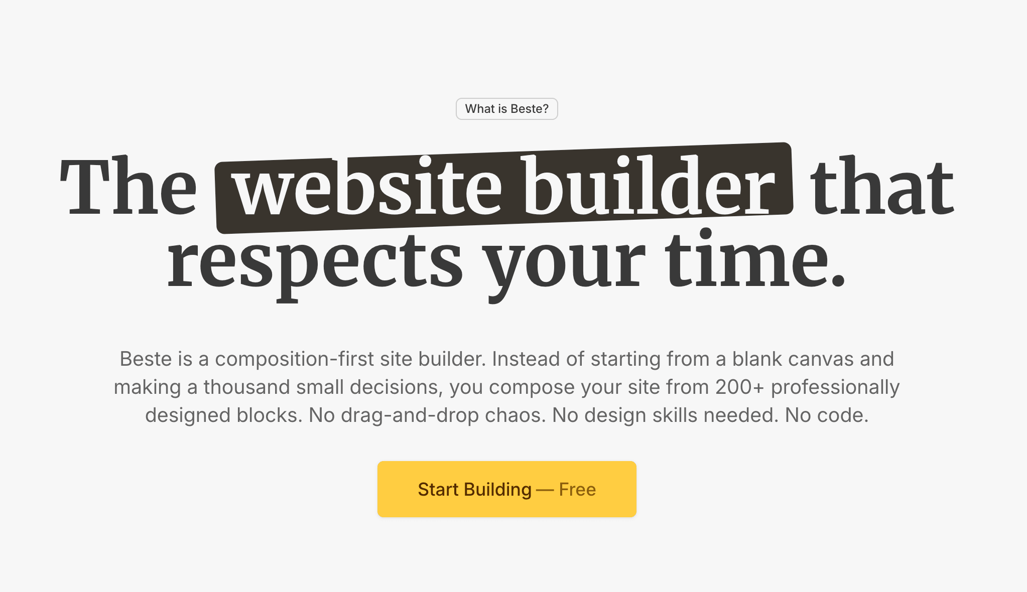
1. Hero section
This is the first thing visitors see. It needs to answer three questions in under five seconds: what is this, who is it for, and what should I do next. A clear headline, a one-sentence subheading, and a call-to-action button. That's it. Don't overthink it. The hero is not the place for your company backstory — it's the place for your value proposition.
A good rule of thumb: if someone reads only your headline and subheading, they should understand exactly what you're offering. Everything else on the page just reinforces that first impression.

2. Social proof
Right below the hero, before you explain anything else, show that other people trust you. This could be client logos, a row of testimonials, a "trusted by X users" line, or even a screenshot of a positive review. Social proof works because it shifts the burden of persuasion — instead of you claiming your product is good, other people are saying it for you.
If you're just starting and don't have logos or testimonials yet, a simple "Join 200+ early users" or even a quote from a beta tester works. The point is to create a moment of trust before the visitor commits to reading more.
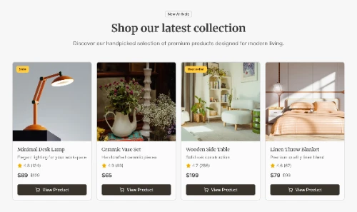
3. Features or benefits
Now explain what your product or service actually does. But here's the important part: frame it in terms of outcomes, not capabilities. Don't say "AI-powered analytics dashboard." Say "See exactly where your visitors drop off — without touching a spreadsheet."
Three to four features are enough. Each one should have a short headline, one to two sentences of explanation, and optionally an icon or small illustration. This section answers "how does this help me?"
4. How it works
Strip away complexity. Show the visitor that going from where they are now to where they want to be is simple. Three steps is ideal. "Sign up → Set up your project → Publish." Or "Tell us what you need → We send you options → You pick the one you like."
This section exists to reduce friction. If a visitor thinks the process is complicated, they won't take the first step. Make it look easy — because with the right tool, it usually is.
5. FAQ
This is one of the most underrated sections on any landing page. A well-written FAQ doesn't just answer questions — it handles objections. Think about the three to five reasons someone might hesitate: "Is it really free?" "What happens after the trial?" "Can I use my own domain?" "Do I need to know how to code?"
Each answer should be two to three sentences. Direct, honest, no marketing fluff. FAQ sections also help with SEO, because they naturally include the long-tail questions people type into search engines. If you mark them up with FAQ schema, they can even appear as rich results in Google.
6. Final CTA
The visitor has read your page. They understand the offer. They've seen proof. Now give them one more clear opportunity to act. Repeat your main call-to-action with a slightly different angle — maybe emphasize the low risk ("Start free, no credit card") or the urgency ("Launch your page this weekend").
The final CTA section often mirrors the hero: a strong headline, a sentence of support, and a button. It closes the loop.
Building the page: a step-by-step walkthrough
Now that you have the structure, let's build. We'll use Beste for this walkthrough because it's built around exactly this workflow — pick blocks, customize through a sidebar, publish. But the principles apply to any block-based builder.
Step 1: Choose your hero (10 minutes)
Open the block library and browse the hero sections. You're looking for one that matches the structure of your message. If your value proposition is one strong headline plus a CTA, pick a minimal hero. If you have a product screenshot you want to show, pick a hero with a media area.
Don't worry about colors yet. Pick the layout first.
Drop it onto your page. Click on the headline and replace it with your own. Same for the subheading and button text. In the sidebar, adjust the button's link to point to your signup page or contact form.
One common mistake here: writing a headline that's too clever. "Your business, reimagined" sounds nice but says nothing. "Build a professional website in 2 hours" is specific and clear. Specificity wins.
Step 2: Add social proof (5 minutes)
Grab a logos bar or testimonial block from the library. If you're using logos, upload the files and space them evenly. If you're using testimonials, pick two to three of your best quotes. Short quotes work better than long ones — one to two sentences each, with a name and title.
If you're brand new and have no social proof, skip this section for now. You can always add it later. A landing page without testimonials is better than one with fake ones.
Step 3: Build your features section (15 minutes)
Pick a features block — usually a grid of three or four items, each with an icon, a headline, and a short description. This is where you'll spend the most time writing.
For each feature, follow this pattern: start with the outcome (what the user gets), then briefly explain how it works. Keep each description to two sentences maximum.
If you're choosing icons, don't overthink it. A checkmark, a lightning bolt, a shield, a chart — these universal symbols communicate faster than custom illustrations. Shadcn blocks come with Lucide icons built in, so you have hundreds of options without uploading anything.
Step 4: Add a "how it works" section (10 minutes)
Drop in a steps block — three numbered items with a headline and short description each. The job here is radical simplification. Whatever your process actually involves behind the scenes, reduce it to three human-readable steps.
Protip: start each step with an action verb. "Create your account." "Choose your sections." "Hit publish." Action verbs create momentum.

Step 5: Write your FAQ (15 minutes)
Add a FAQ block. Write five questions and answers. If you're stuck, use this framework: one question about price, one about getting started, one about the core product, one about a common objection, and one about what makes you different.
Keep answers short. If your answer needs more than three sentences, it probably belongs on a separate page, not in an FAQ.
Step 6: Close with a final CTA (5 minutes)
Drop in a CTA block. Write a headline that feels like a nudge, not a push. "Ready to launch?" works. "Don't miss out on this limited-time offer!!!" does not.
Repeat the same button text and link from your hero. Consistency matters — the visitor should never wonder where a button leads.
Step 7: Review and publish (15 minutes)
Scroll through the entire page from top to bottom. Read every headline. Click every button. Check it on mobile — most visitors will see your page on a phone, and responsive design isn't optional.
Things to check: is your headline clear? Is there too much text anywhere? Do the colors feel consistent? Is the CTA button easy to find on every screen size?
If everything looks good, set your custom domain, check your SEO settings, and hit publish.
Total time: under two hours. Probably closer to 75 minutes once you get the hang of it.
The blocks advantage
The reason this process is fast isn't because we're cutting corners — it's because the design decisions were already made. Each block in a well-built library handles its own spacing, typography, alignment, and responsive behavior. You're not wrestling with CSS. You're not dragging elements pixel by pixel. You're making content decisions, which is where your time should go.
This is the core idea behind block-based website building. Instead of starting with a blank canvas and unlimited freedom (which sounds good but usually ends badly), you start with constraints that were designed to produce good results. You choose from sections that already work, arrange them in an order that makes sense, and focus your energy on writing clear, compelling copy.
For developers who want the code, Beste UI is a shadcn block library focused specifically on website sections — heroes, feature grids, pricing tables, testimonial blocks, and more. Copy-paste into your Next.js project, or just use it as design inspiration.
And if you want to explore what's available beyond any single library, Shoogle lets you search across dozens of shadcn/ui block libraries at once. Type "hero" or "pricing" and see matching blocks from across the entire ecosystem — it's the fastest way to find the right section for your page.
What about the content?
We've been talking about structure and tools, but the real work of a landing page is the writing. The best-designed page in the world won't convert if the headline is vague, the benefits are generic, or the CTA is buried. (We wrote a full guide on how to write website copy that converts — but here are the key principles that apply specifically to landing pages.)
Write for scanners, not readers. Most visitors won't read your landing page word by word. They'll scan headlines, glance at icons, and read the first sentence of each section. Make sure the headline of every section tells a complete story on its own.
Kill the jargon. If your grandmother wouldn't understand it, rewrite it. "Seamless omnichannel integration" means nothing to most people. "Works with your email, your store, and your social accounts" means everything.
One page, one action. This is the golden rule. Your landing page should have exactly one call-to-action. Not three. Not "sign up or watch a demo or read our blog or follow us on Twitter." One thing. Every section should point toward that one thing.
Be honest about what you're offering. If it's free, say free. If there's a trial period, say how long. If there are limitations, mention them. Trust is the most valuable conversion asset you have, and it's built through transparency, not hype.
After you publish
A landing page isn't done when it goes live. It's done when it converts. Here are the immediate next steps:
Set up Google Analytics or a lightweight alternative like Plausible so you can see how many people visit and what they do. If you're using Beste, you can add these integrations without touching any code — just paste your tracking ID in the settings and it's live across every page. Submit your URL to Google Search Console so it gets indexed. Share the link. Get feedback from three to five people who fit your target audience. Watch where they hesitate.
Then iterate. Change a headline. Swap a section order. Rewrite a FAQ answer. The first version of your landing page is never the final one — but the important thing is that it exists.
You can't optimize a page that hasn't been published yet. Ship first. Polish later.